My own projects / Brand identity
Milkplexity.
A little personality.
A very recognizable pour.
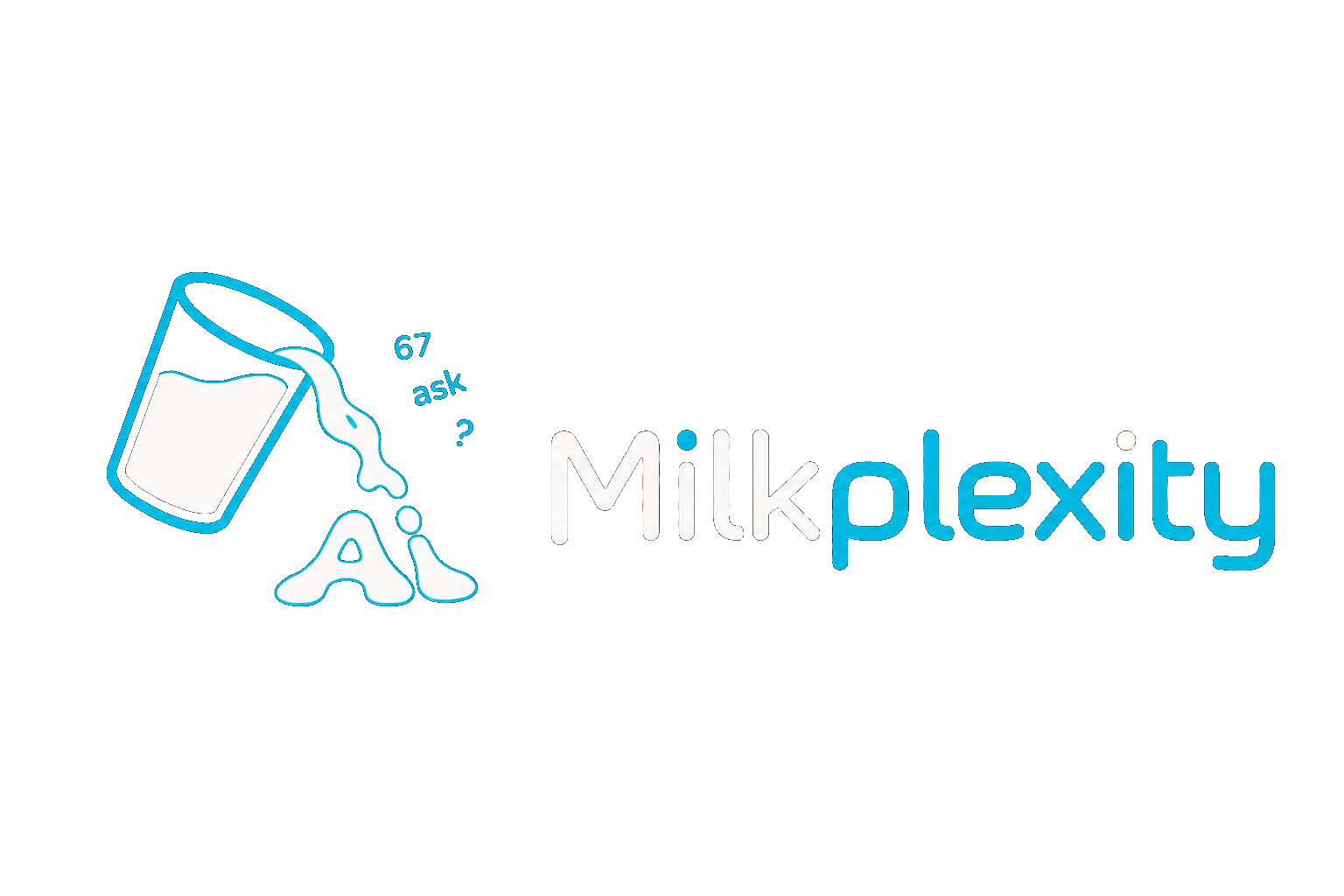
01 / The main identity
A name with
its own visual language.
The main Milkplexity logo puts the pouring-glass symbol beside a rounded wordmark. White and cyan keep the two parts connected; the milk forms the AI lettering underneath the glass.
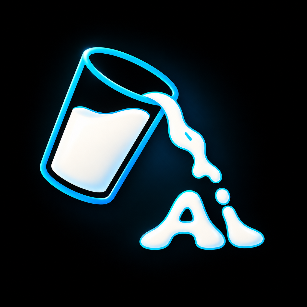
02 / The standalone mark
The same idea.
Without the wordmark.
The pouring glass carries the identity on its own. A simple silhouette, bright cyan edges, and the milk-formed lettering keep it connected to the full logo.
03 / Milkplexity Learn
A related identity.
Its own expression.
The Learn artwork brings the symbol and wordmark into a vertical composition. The brighter edges and dimensional lettering give it a different presence while keeping the same cyan-and-white palette.
Look closer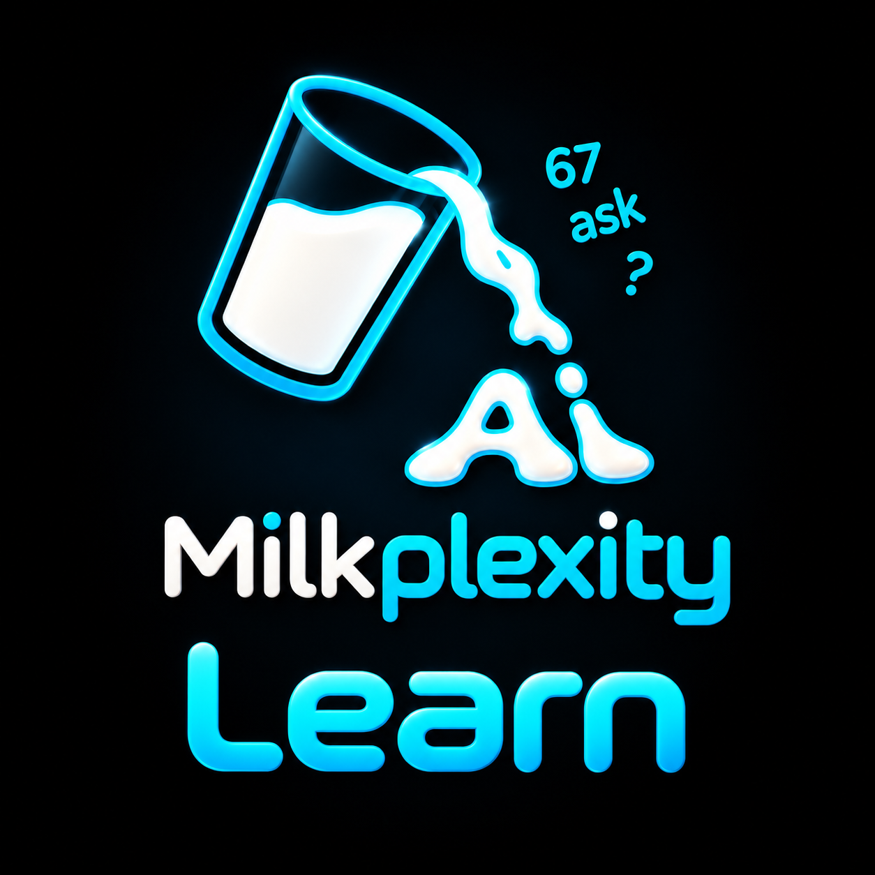
Projects & opportunities
Have a project
or a role in mind?
Tell me what you’re working on. I’m interested in creative collaborations, brand projects, and opportunities to join a team.